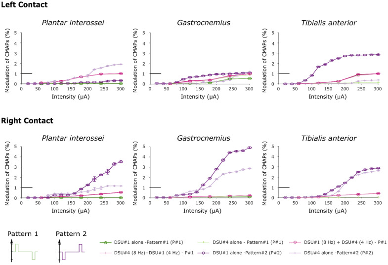
Figure 6.
Recruitment curves obtained after stimulating with two distinct stimulation patterns. In this figure, both “Pattern 2” curves were obtained after performing the third protocol. Note that the little horizontal bold line indicates the maximum RMS value used to normalize the data (corresponds to y = 1).

