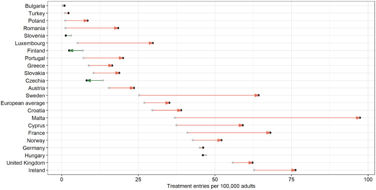
Figure 4.
Change in treatment admissions per 100,000 adults between 2010 and 2019 for all countries with available data and their average. Green color indicates countries with declining trend, red color indicates countries with increasing trend. Arrows are only presented for countries with a change in treatment rates of at least 3 admissions per 100,000 adults.

