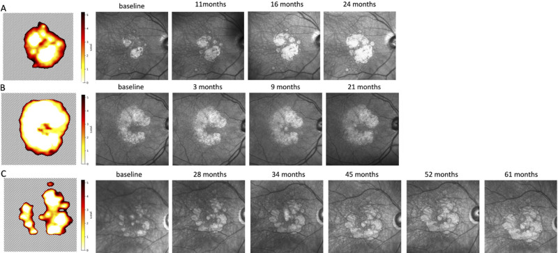
Figure 9.
Atrophy risk map derived from our model predictions—time in years from baseline until conversion to RORA. White region denotes that RORA was present at the baseline, and the dashed region indicates that RORA is not present there within the next five years. The risk map was obtained using baseline OCT as an input. The infrared images to the left of the risk map were acquired at subsequent visits.

