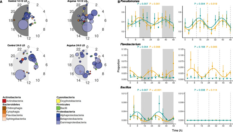
Fig. 5.
A Polar plots showing times of peak relative abundance of significantly rhythmic microbiome genera. Each circle represents a genus, coloured by class and scaled by average relative abundance. Radian indicates time of peak and distance from centre indicates significance (more significant/stronger rhythms towards edge of plot). B Examples of rhythmic bacteria genera (full results presented in Supplementary Table 8). Mean proportion of community (± 1 S.E.) of bacteria genera of uninfected (cyan) and Argulus-infected (orange) rainbow trout maintained at 12:12 LD (left) and 24:0 LD (right). Curves denote cosinor waveform fitted using CircaCompare. Grey shading indicates time periods in darkness (grey dashing indicates equivalent 12:12 LD light transitions on 24:0 LD plots)

