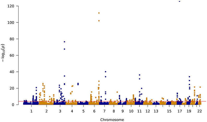
Figure 2.
Manhattan plot of association results obtained from the prostate cancer transcriptome-wide association study. The red line represents P = 2.01 × 10⁻³ (FDR-corrected P value ≤ 0.05). Each dot represents the genetically predicted expression of one specific gene by prostate tissue prediction models: the x axis represents the genomic position of the corresponding gene, and the y axis represents the negative logarithm of the association P value.

