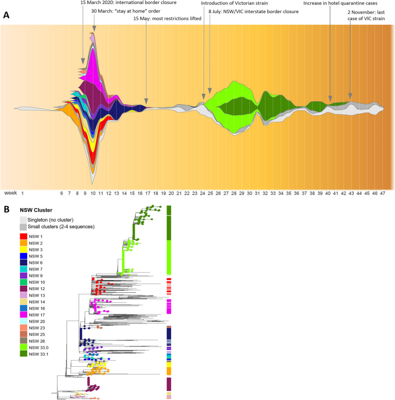
Fig. 1.
Epi-fishplot illustrating the rise and fall of SARS-CoV-2 genomic clusters in NSW over the course of the pandemic in 2020 (plotted by epidemiological week, from 22/1/2020). a The height of the plot at each week (vertical white line) is proportional to the total number of genomes obtained from COVID-19 cases sampled that week. The colour represents the assigned genomic cluster. The full height of the Y-axis is proportional to the largest number of sequences obtained for any time point (185 sequences, sampled during the 10th week of 22–28 March 2020). This plot illustrates large number of distinct genomic clusters introduced from overseas to Australia during the initial months of the pandemic, and their rapid elimination as a consequence of border closure and lockdown measures. It also illustrates the spread and steady elimination of a “second-wave” outbreak introduced from the state of Victoria prior to interstate border closure, consisting of two related clusters, NSW33.0 and NSW33.1. b Classic phylogenetic tree representation of the same dataset, representing the relatedness of all sequenced cases in NSW. Clusters with ≥ 5 sequences are indicated in the metabar and coloured according to the colour scheme of the epi-fishplot (a). The phylogenetic tree was constructed as described previously1

