
FIGURE 5.
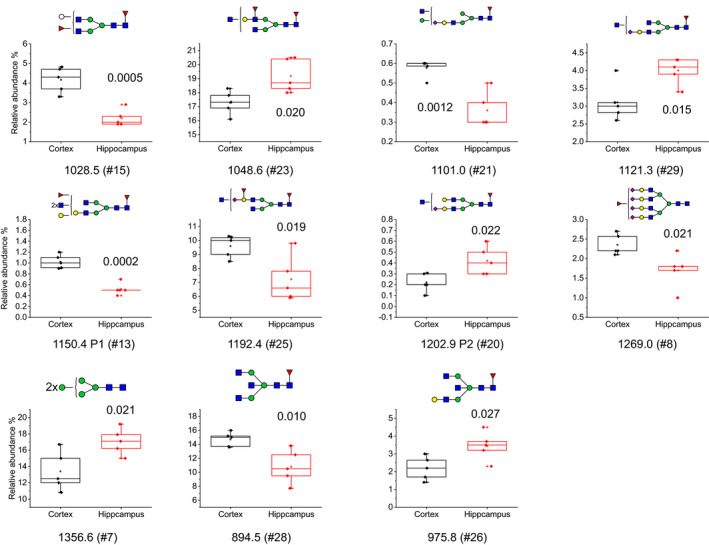
Relative abundance boxplots of structures that were significantly different in control hippocampus (n = 5) and control cortex (n = 5) using student's T‐test (with n referring to the number of individual cases included in the study). The P‐value for each structure is shown in each plot. The boxplots are displaying Max, Min, 99%, 1% and mean in the plot, in addition to the individual data points