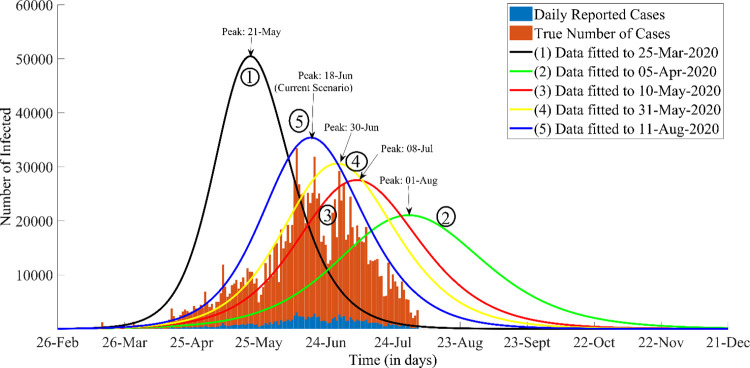
Fig 2. The Evolution of the COVID-19 modelling paradigm for different epidemic timelines in Sindh.
The labelled graphs depict the number of infected individuals throughout the course of the epidemic. The curves correspond to the following important events: 1. The initial model outcome was based on the parameter values obtained from data for Wuhan, China and shows an unprecedented growth of the epidemic. 2. Initial Lockdown and community sensitization was more effective. The green plot depicts the most feasible outcome, had the preventive trend continued. 3. Testing Capacity increased from beginning of April onwards which is why more cases were being reported, shifting the data curves fitted till day 60 (red) further to the left of green curve. 4. A further surge in transmission was observed after 9th May was due to ease in lockdown, which pushed the peak of the yellow plot around 17% backwards. 5. It is evident from the blue plot (latest results) that due to the recent Eid celebrations and re-opening of non-essential businesses, the curve has moved further backward consequently hastening the peak of the epidemic Note: The blue stacked bars represent the daily reported cases and the brown stacked bars reflects the model assumption of having 10 times more (actual) cases than reported.

