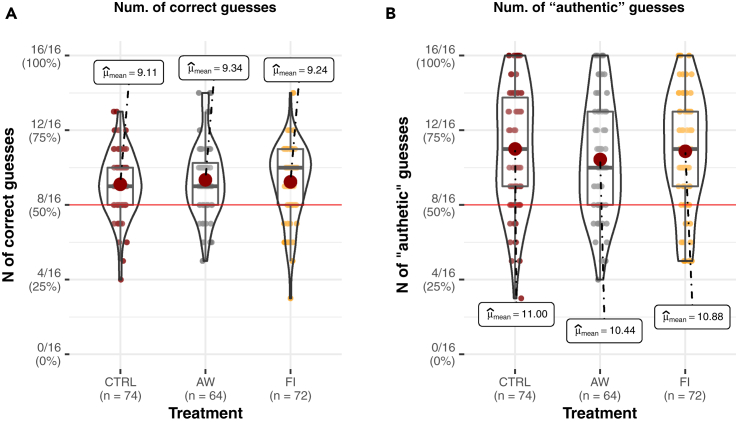
Figure 4.
Guessing behavior—Correct and “authentic” guesses
(A) Violin plots of the distribution of the number of correct guesses a participant made (y axis) by the treatment (x axis).
(B) Violin plots of the distribution of frequency of “authentic” guesses (y axis) by the treatment (x axis). Dark gray lines represent medians; the dark red dots represent means. Boxes indicate the interquartile range; each dot shows a raw data point. Plots created with the Ggstatsplot package (Patil, 2018).

