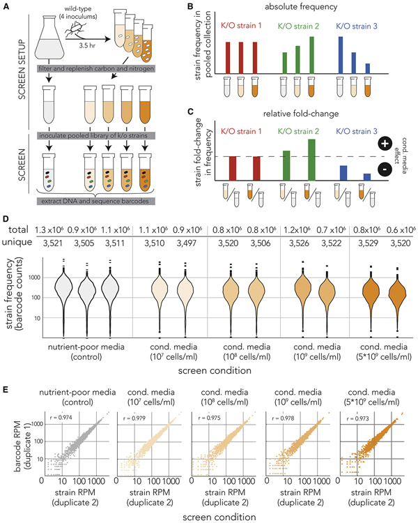
Figure 1. Pooled genetic screen of knockout strains in conditioned media.
(A) Overview of screen approach. We inoculated the wild-type E. coli strain at four different concentrations into nutrient-poor media and grew it for 3.5 hours before filtering. We replenished the carbon and nitrogen sources and then inoculated a pooled collection of 3,680 knockout strains into the filtered media (marked by cells with different colors). We grew the cultures for 7 hours before we extracted genomic DNA and amplified the barcode region. Lastly, we sequenced the amplicon and calculated the frequency of individual barcodes that correspond to individual knockout strains. The orange gradient color marks conditioned media filtered from cultures inoculated at different densities. (B) Inference of conditioned-media impact on individual knockout strains by monitoring changes in barcode frequency. We calculated the frequencies of each knockout strain (barcode) across all screen conditions. We calculated the fold-change in strain (barcode) frequency in conditioned-media (orange tube) relative to the unconditioned-media control (grey tube). We identified strains unaffected by conditioned media (red bars), strains benefiting from conditioned media (green bars), and strains compromised by conditioned media (blue bars). (C) We used the fold-change in knockout strain frequency to measure impact of conditioned media on knockout strains. (D) The genetic sequencing yielded similar barcode coverage across all experiments. The violin plots show the number of times each knockout strain (individual barcode) was detected in each screen experiment. The table above shows the number of unique strains (barcodes) we detected in each screen condition and the total of number barcodes we identified in DNA reads. (E) High correlation between strain frequency in biological duplicates. The scatter plots show the strain (barcode) frequency after normalization to reads-per-million (RPM) in biological duplicates. The Pearson correlation coefficient is shown in the upper left of each scatter plot.

