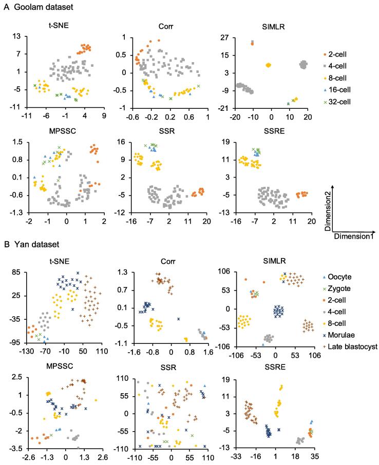
Figure 3.
Visualization of Goolam and Yan datasets using different methods
Two datasets are visualized by t-SNE, Corr, SIMLR, MPSSC, SSR, and SSRE, respectively. A. The clustering results from Goolam dataset [38]. B. The clustering results from Yan dataset [37]. Each point in the figure represents a cell. Different colors and shapes indicate different cell types. t-SNE, t-distributed stochastic neighbor embedding; SIMLR, single-cell interpretation via multikernel learning.

