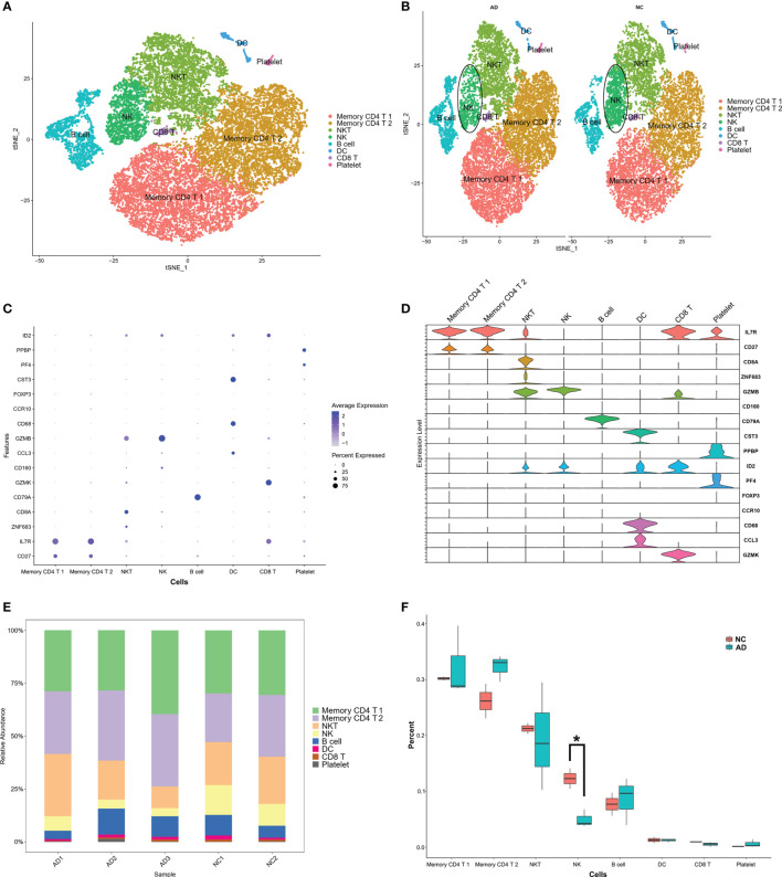
Figure 2.
Marker gene expression of each cluster. (A) tSNE projection of 24,679 cells from all PBMCs. Different cell types were colored with unique colors. (B) tSNE projection of AD and NC groups, respectively. NK cells were labeled with ellipse tag, which were decreased in AD group. (C) Dot plot of cell type marker genes. Cell specific marker genes were selected according to previous study by Sinha D (11). The color of dots represents average expression, and size of dots represents average percent of cells expressing selected gene. (D) Violin plot depicts distributions of cell type marker genes in each cluster using density curves. The width of each violin plot corresponds with the frequency of cells with relevant gene expression level. (E) Cluster distribution in each sample. (F) Cluster distribution in AD and NC group. The percent of NK cluster was decreased in PBMC of AD group. * means, P < 0.05 compared with NC group.

