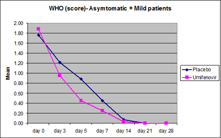
Figure 3.
Reduction in the mean WHO scores plotted in Asymptomatic and Mild patients (n=82). Pink curves represent the reduction in the mean WHO scores on days 0,3,5,7,14,21 and 28 respectively while blue curves depict the reduction in the average WHO scores on the respective days plotted on the X-axis. Significant difference in the reduction in the mean WHO score was observed on day 5 in the Mild-Asymptomatic patients (P=0.019).

