Fig. 7.
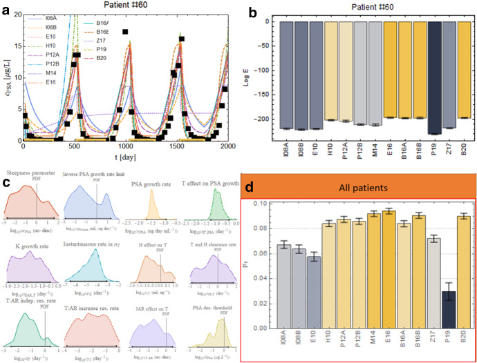
Bayesian model comparison results. a Best fits for the 13 models analyzed for a representative patient. The black squares are the error bars enhanced with a more prominent marker for visibility reasons; yellow lines along the x-axis represent the on-treatment periods. b Model log-evidence comparison on patient #60 with error bars as obtained by nest-sampling technique. The color range shows the best-performing model (yellow) and fades to the worst-performing model (gray). c Unnormalized posterior PDF for the best performing model, E16, and credible interval as black segment over the x-axis. d Comparison between the normalized log-evidence overall patient data. (The color scheme is consistent with panel b) (Color figure online)

