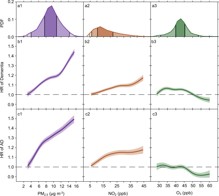
Fig. 3. Concentration-response curves. Panel.
a presents the probability distribution functions (PDF) of long-term PM2.5, NO2, and O3 exposures; Panel b presents the concentration–response relationships between each pollutant and dementia; Panel c presents the concentration-response relationships between each pollutant and Alzheimer’s disease (AD). The concentration–response curves, derived from the tri-pollutant models, are shown for the concentration ranges between 0.5th to 99.5th percentiles of the pollutants, i.e. with 1% poorly constrained extreme values excluded. Shading areas (from the darkest to the lightest) in a represent pollutant concentration ranges of the IQR (i.e., 25th to 75th percentiles), 95% (2.5th to 97.5th), and 99% (0.5th to 99.5th), respectively. Source data are provided as a Source Data file.

