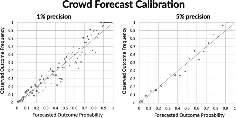
Fig. 3.
Crowd forecast reliability. The charts plot the proportion of forecasts with probability p that correspond to outcomes that occurred. The left plot shows the data at the 0.01 probability level of precision. In the right plot, all the outcomes forecasted at probabilities [.01, .05] are grouped together into a single data point, then all the outcomes forecasted with probabilities within [.06, .10], etc. This grouping by successive chunks of 5% helps reduce the noise in the data. The closer the data points align with the diagonal, the more reliable the forecast probabilities are. The surface area of each dot indicates relative number of forecasts made at that level of probability. A greater proportion of forecasts were made at lower probabilities because the majority of IFPs featured 3 or more outcomes, only one of which could eventually occur

