
FIGURE 1.
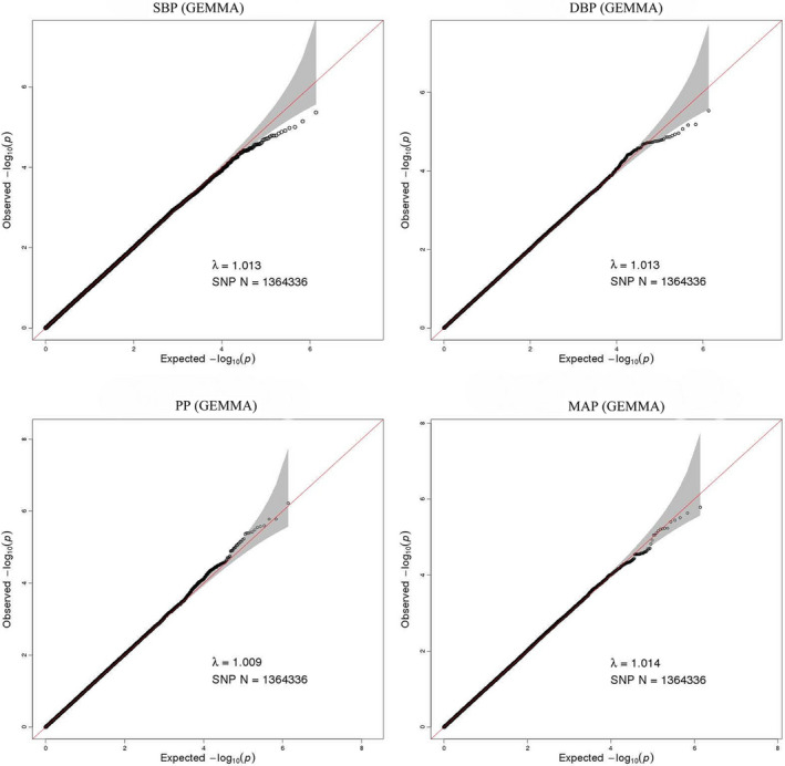
Quantile‐quantile plot for quality control check and visualizing crude association for genome‐wide association study of SBP, DBP, PP, and MAP. The x‐axis shows the −log10 of expected p‐values of association from chi‐square distribution and the y‐axis shows the −log10 of p‐values from the observed chi‐square distribution. The black dots represent the observed data, and the red line is the expectation under the null hypothesis of no association