
FIGURE 3.
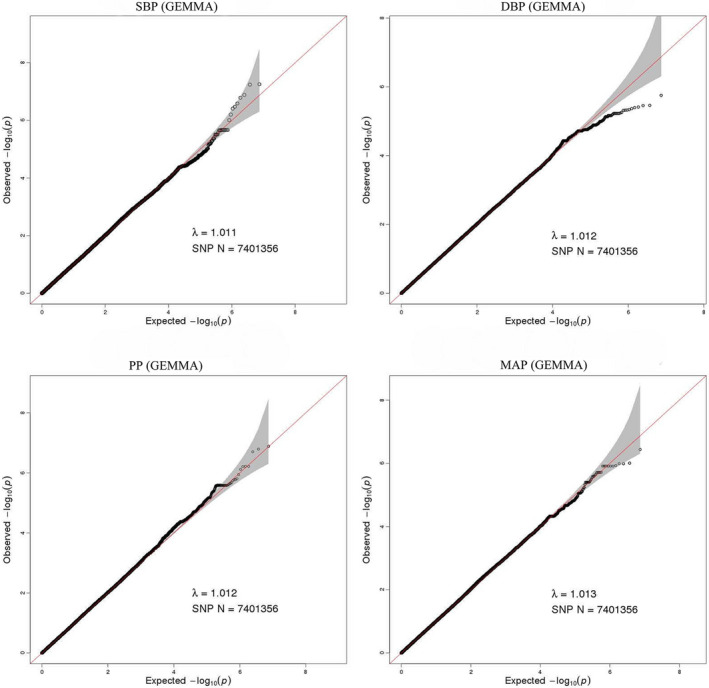
Quantile‐quantile plot for quality control check and visualizing crude association for genome‐wide association study of SBP, DBP, PP, and MAP. The x‐axis shows the −log10 of expected p‐values of association from chi‐square distribution and the y‐axis shows the −log10 of p‐values from the observed chi‐square distribution. The black dots represent the observed data, and the red line is the expectation under the null hypothesis of no association (after imputation)