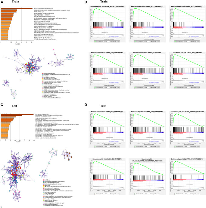
FIGURE 4.
Enrichment analysis of differentially expressed genes (DEGs) between the high- and low-risk subgroups. (A,C) Bar graph of enriched terms across input gene lists, colored by p-values, and network of enriched terms, colored by cluster ID, where nodes that share the same cluster ID are typically close to each other. (B,D) Gene set enrichment analysis (GSEA) indicating that hallmarks were enriched in the high-risk subgroup of the training and testing sets. “Log10(P)” is the p-value in log base 10.

