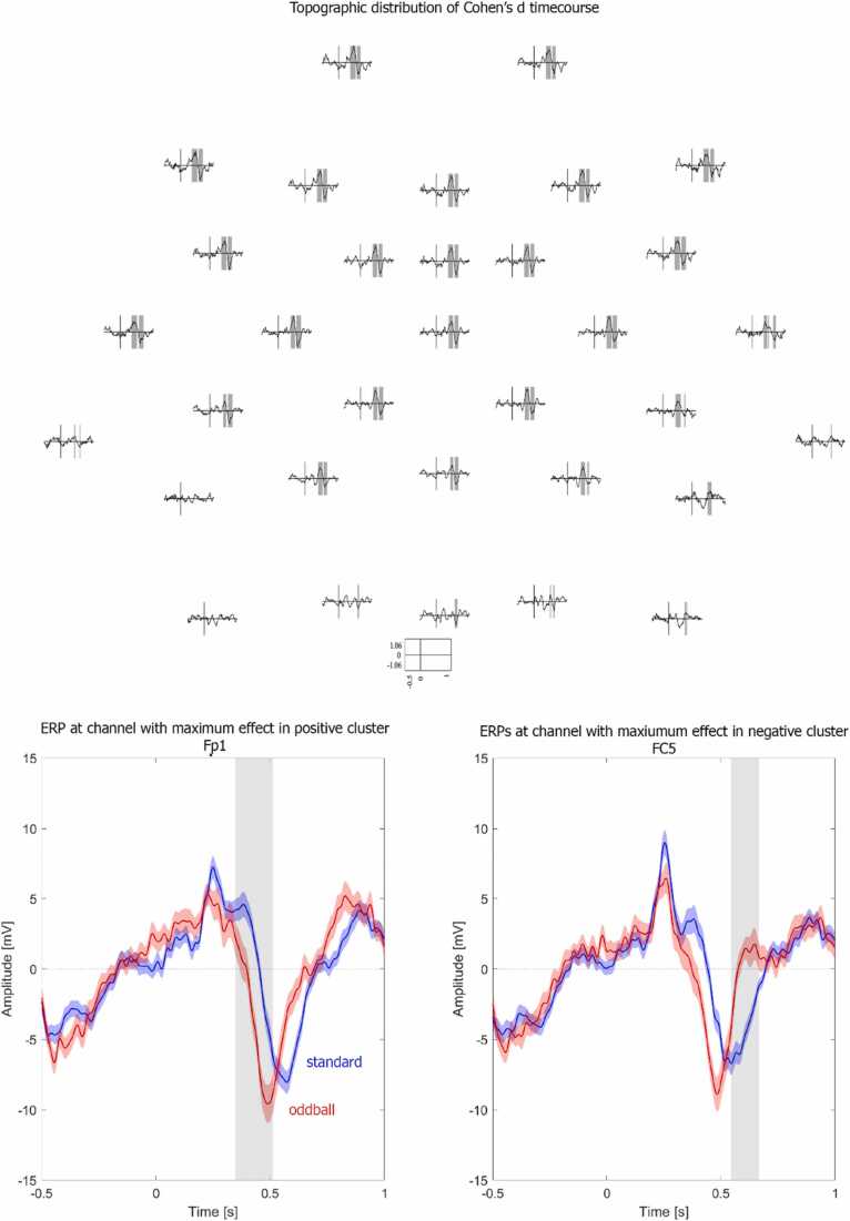
Fig. 4.
Illustration of effect size. Top: Topographic distribution of Cohen’s d across time. Shaded areas represent data points that fall into the negative or positive cluster. Bottom: Event-related potentials of standard (blue) and oddball (red) conditions at the channel with the maximum effect size of the positive (left) and negative (right) cluster. The grey shaded areas reflect the time window falling into the positive (left) and negative (right) cluster. Shaded areas around the ERPs represent + /- one standard error of the mean.

