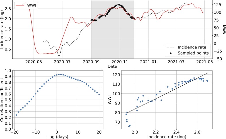
Fig. 6.
Subsampling example on the Lagny-sur-Marne WWTP. The top plot shows WWI and incidence rate curves as well as the sample points selected for that simulation (the shadowy area corresponds to the period of interest). The bottom left plot displays the computed correlation values for lag values varying between −20 and 20 days. A positive lag means that the WWI is ahead of the incidence rate. A negative lag means that the WWI is lagging behind the incidence rate. The bottom right plot displays a scatter plot of WWI vs incidence rate at best time lag (2 days, with a correlation coefficient of 0.93), as well as the linear regression fitted on the data.

