Figure 2.
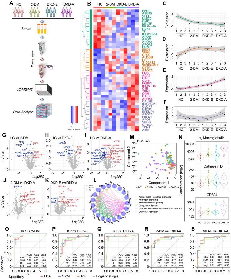
Proteomics deciphered the status of DKD. (A) Working pipeline for proteomics data collection from the participants. (B) Heatmap for biomarker detection from the proteomics data. Each row represents a protein marker, and each column represents a loading sample across the four groups, including HC, 2-DM, DKD-E, and DKD-A. Protein markers are grouped into four clusters via hierarchical clustering. (C–F) Protein expression corresponding to the four clusters shown in Figure 1B. The four clusters showed out-down, up-flat, up, and down-up patterns, respectively. (G–K) Volcano plots of the proteomics data for each pairwise comparison. The x-axis is log2 fold-change and the y-axis represents the minus log10 p-value. Overexpressed and underexpressed proteins are marked with red and blue colors, respectively. (L) Network plot illustrating the enriched pathways detected by the differentially expressed proteins. Each node represents a protein, and the proteins are connected by their involved pathways. (M) Partial least squares discriminant analysis based on the ELISA markers. (N) Violin plots illustrate the concentration of α2-macroglobulin, cathepsin D, and CD324 in each group by ELISA. (O–S) Receiver operating characteristic (ROC) curves for each pairwise prediction by four different machine learning methods. Redline for linear discriminant analysis (LDA), blue line for support vector machine (SVM), orange line for random forest (RF), and green line for logistic regression (Logi). AUC: the area under the curve; Accu: accuracy; Youd: Youden index.

