Figure 4.
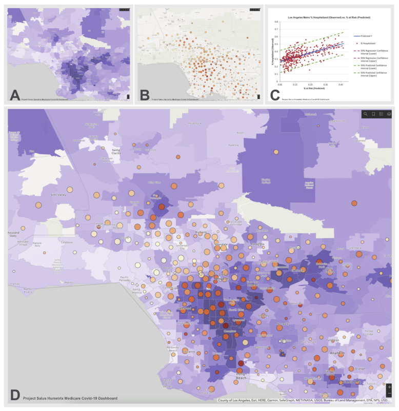
Los Angeles COVID-19 Hospitalization Risk Map. Panel A shows the percentage of the Salus cohort with a predicted probability of hospitalization when diagnosed with COVID-19 of over 0.55 on a light blue to dark lavender color scale. Panel B shows the cumulative number of hospitalizations per zip code (increasing size of circles denotes a higher hospitalization count) with the percentage of cases requiring hospitalization shown on a beige to dark orange scale. Panel C shows a linear regression analysis of the case hospitalization rate (Y axis) as a function of the risk level in each zip code (regression R2 = 0.35); Panel D is an overlay of panel B on Panel A and demonstrates that zip codes with the highest predicted probabilities of hospitalization with COVID-19 tend to have higher observed percentage of cases requiring hospitalization and vice versa.

