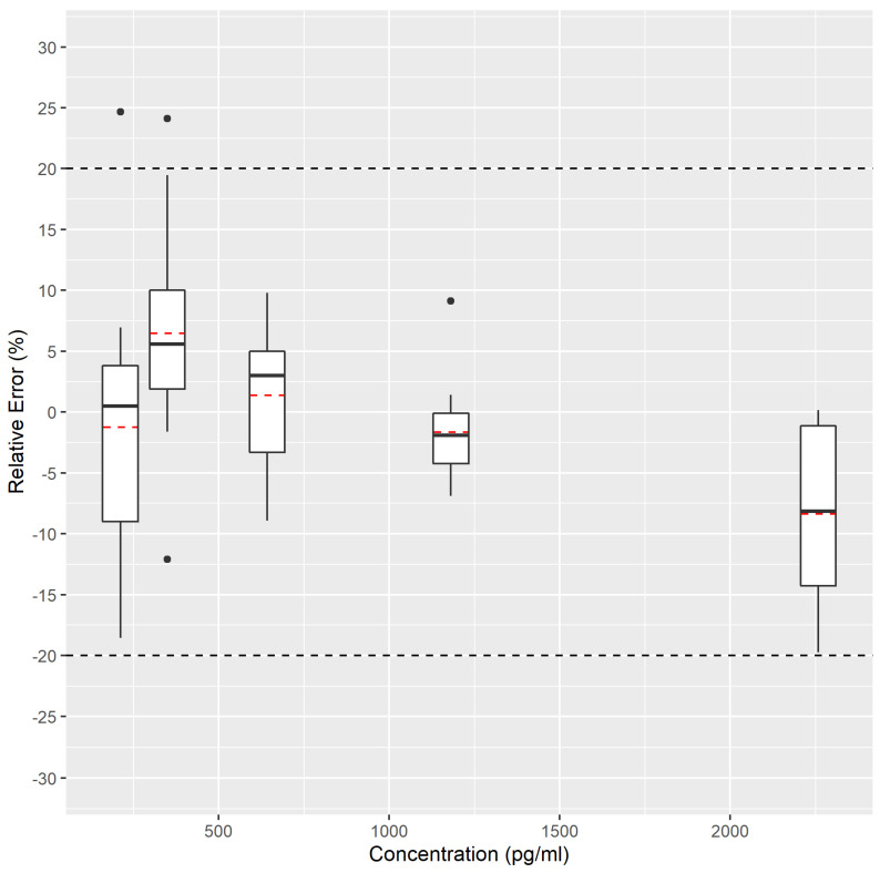
Figure 2.
Accuracy profile for MDA analysis in EBC represented in the form of a box-and-whisker plot. The figure denotes the measured relative error compared to the targeted spiked concentration. The black central line represents the median value (50th percentile) whereas the red dashed lines represent the average value. The upper and lower whiskers correspond to the adjacent values as defined by Tukey [42]. Black dots correspond to data points falling outside the adjacent values that can be considered as potential outliers. Theywere plotted separately. The external dashed lines correspond to the acceptance limits (fixed at 20%).

