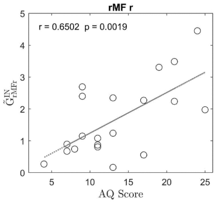
Figure 2.
Plot of the regression line between the sum of the normalized connections entering a given region (input sum ) and the Autism Spectrum Quotient (AQ) score, obtained using data from 20 participants. Only plots in the region that exhibit a correlation coefficient higher than 0.4, with a significant p value for the correlation and a significant difference between the two classes, are shown. In the plot, the regression coefficient and the p value for testing the hypothesis of no-correlation are shown in the label. It is worth noting that to obtain this plot, the connection matrix for each participant was normalized so that the total sum of connection strength was as high as 100 (see Equations (4), (5) and (7)); hence, for example, a value of 3 on the y-axis indicates that 3% of the total connections in the network are entering that particular ROI. Hence, the values in the plot summarize whether the connections entering the node are stronger (high value) or weaker (low value) compared to the total sum of the connections in the same participant.

