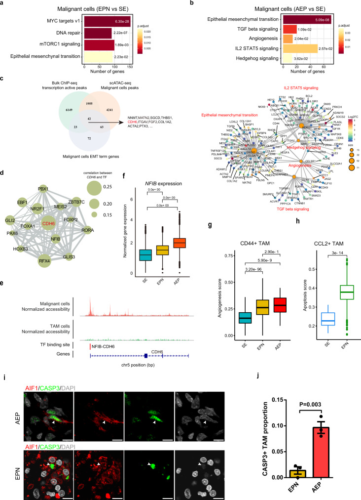
Fig. 5. Transcriptional differences detected by scRNA-seq analyses reveal cancer subtype-specific characteristics.
a Bar plot of enriched hallmark pathways for genes upregulated in malignant cells from EPN. Adjusted P values were labeled for each pathway. Adjusted P values were calculated by using enrichr function from R package clusterProfiler with hypergeometric test statistical analyses. b Bar plot of enriched hallmark pathways for genes upregulated in malignant cells from AEP (top). Network plot of enriched hallmark pathways for upregulated genes in malignant cells from AEP. Nodes for genes were colored by log2FC, and sizes of nodes for enriched pathways were correlated with the number of genes (bottom). Adjusted P values were labeled for each pathway. Adjusted P values were calculated by using enrichr function from R package clusterProfiler with hypergeometric test statistical analyses. c Venn plot showing the intersection of EMT-related genes with active transcriptional signals. The shared genes are listed on the right side. The red color marks the key genes of interest. d Network plot showing the connection between CDH6 and its upstream TFs. Sizes of circles were related to the correlation value between CDH6 and TFs. e Normalized scATAC-seq profile of CDH6 in AEP across each major subpopulation and NFIB-CDH6 binding site. f Box plot showing the normalized gene expression of NFIB from different cancer subtypes. Adjusted P values were calculated by the Wilcoxon test, two-sided comparisons. n = 122,456 cells. The center line, bounds of box, and whiskers represent mean, 25th to 75th percentile range, and minimum to maximum range in all boxplots. g Box plot showing the angiogenesis signature score of CD44+ TAMs from different cancer subtypes. Adjusted P values were calculated by the Wilcoxon test, two-sided comparisons. n = 3912 cells. The center line, bounds of box, and whiskers represent mean, 25th to 75th percentile range, and minimum to maximum range in all boxplots. h Box plot showing the apoptosis signature score of CCL2+ TAMs from different cancer subtypes. Adjusted P value was calculated by the Wilcoxon test, two-sided comparisons. n = 4647 cells. The center line, bounds of box, and whiskers represent mean, 25th to 75th percentile range, and minimum to maximum range in all boxplots. i Representative example of an EPN and AEP tumor stained by IF. The arrow depicts the CASP3+ TAMs in fluorescent images, and the scale bar represents 30 μm. j Bar plot showing the proportion of CASP3+ TAM in EPN and AEP (n = 3 biologically independent samples). The P value was calculated by t test, Two-way ANOVA analysis. Data are presented as mean values +/− SEM. Source data are provided as a Source Data file. See also Supplementary Fig. 5 and Supplementary Data 4 and 8–10.

