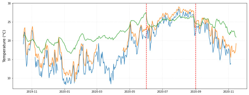
Figure 8.
Evolution over time of daily-mean temperatures: (i) average from all sensors located inside the museum (in green), (ii) from a nearby weather station at 2 km away (in blue), and (iii) from the data-logger installed outside (in orange; part of this trajectory is missing, mainly from March to April 2020). The two vertical dashed lines indicate a period when the indoor temperature suddenly drops lower than the outdoor temperature.

