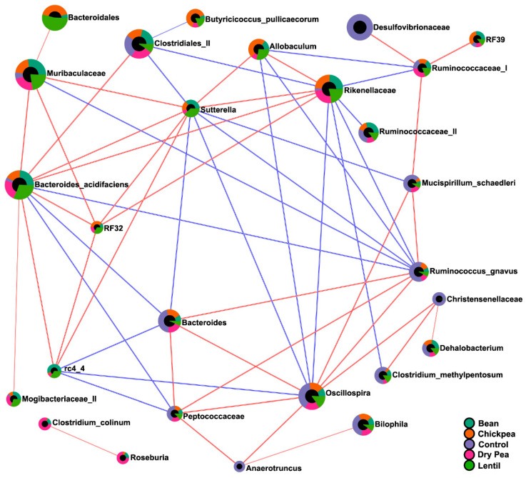
Figure 7.
Correlation network of cecal microbiota across the diet groups. Each node represents a taxon, colored by the mean abundance in a respective diet group. Nodes are connected by the edges representing correlations and their value between taxa pairs: blue indicates negative, while red indicated positive correlation. A correlation network was generated using the SparCC algorithm with 100 permutations, depicting only taxa that met the p-value threshold 0.05 and the correlation threshold 0.7.

