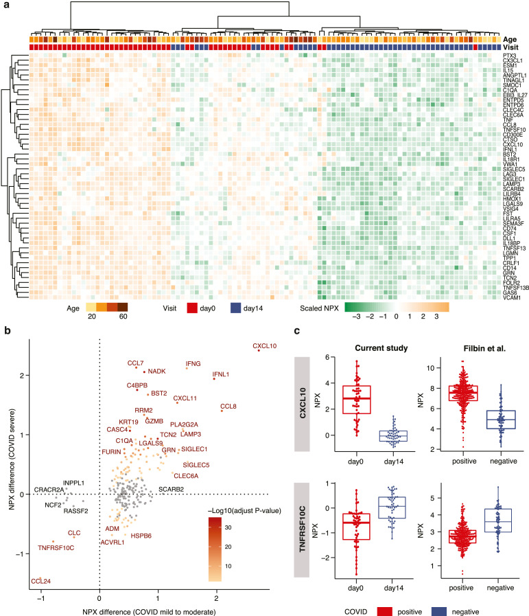
Fig. 4.
Analysis of the plasma proteins related to COVID-19 infection. (a) Heatmap showing the expression levels of the 50 most significant proteins in all day-0 and day-14 samples, clustered based on expression in the 50 proteins. (b) Scatterplot showing the difference in expression levels between day-0 and day-14 samples in our study on the x-axis, and the difference between COVID-19 positive and COVID-19 negative samples in the Filbin et al[16] study on the y-axis. All proteins with a significant difference in our study are shown. The color code depicts the -log10 adjusted p-value in the Filbin et al study, where the grey dots represent non-significant change. The statistical analysis is based on ANOVA with sex, age, bmi as covariates. (c) Boxplots of up- and down- regulated proteins in COVID positive and negative patients in both our study (n = 50) and in the Filbin et al study (n = 242, positive; n = 78, negative).

