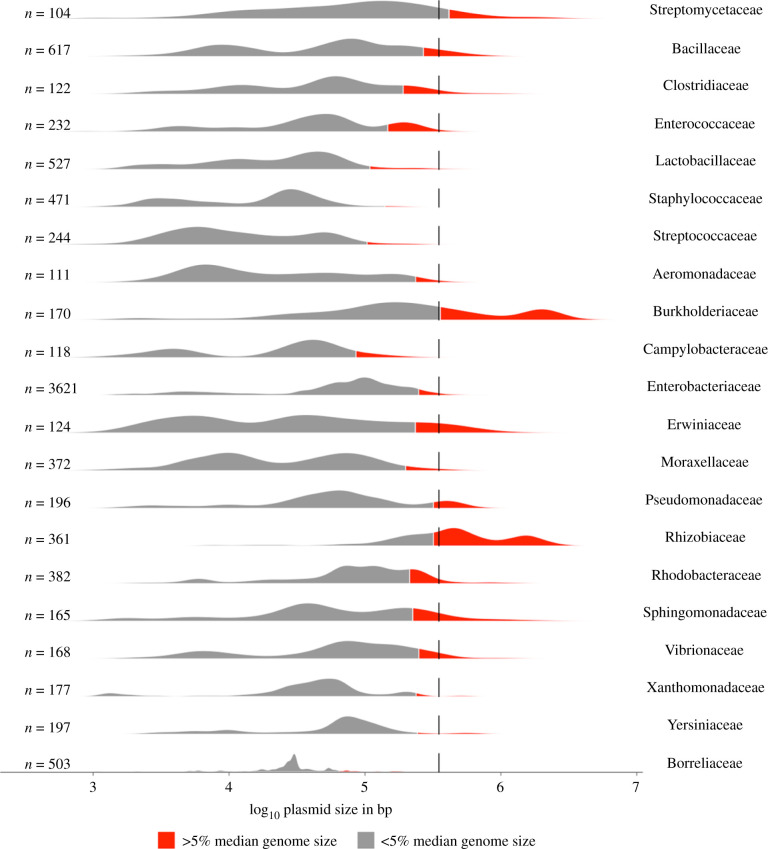
Figure 2.
Plasmid size distributions for families with greater than 100 plasmids in the COMPASS database [13]. The number of plasmids analysed is displayed to the left of each graph. Red filled areas correspond to 5% of the median genome size for each family, according to EZBioCloud [31]. The dotted line indicates 350 kb [19]. Plots were generated in R using the ggplot and tidyverse packages. See the electronic supplementary material for further details.

