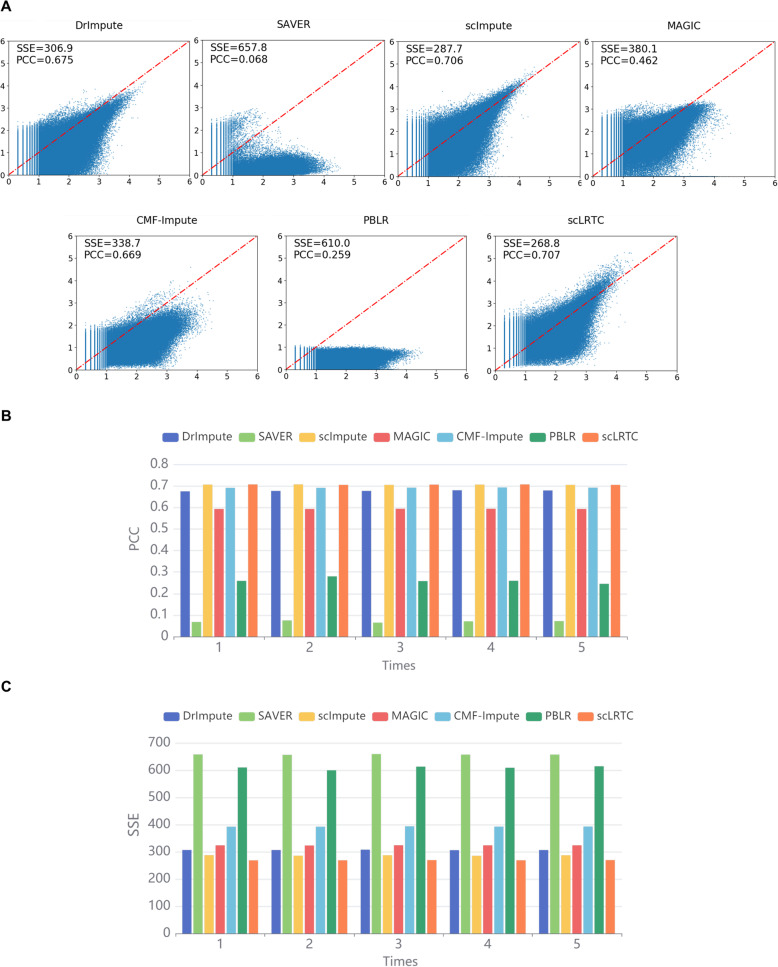
Fig. 5.
Imputation accuracy analysis and comparison of scLRTC and other methods in the real data masking. (A) Scatter plots of the masked imputation data and original data. The x-axis corresponds to the true value of the masked data point, and the y-axis represents the imputation value. The closer the points are to the red centerline, the higher the accuracy of imputaion. SSE and PCC are shown in the upper left corner (data is transformed by log10(X + 1)). (B) PCC values computed with 7 imputation methods in 5 repeated experiments. (C). SSE values computed with 7 imputation methods in 5 repeated experiments

