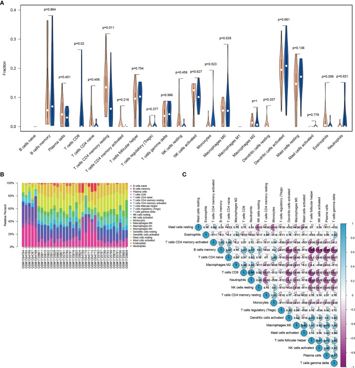
Figure 4.
Visualization of immune cell infiltration analysis. (A) Violin diagram of the abundance of infiltration by 22 immune cell subsets between IDD and control groups. Blue and orange colors represent IDD and control groups, respectively. (B) Histogram of the distribution of infiltrating immune cells in each individual. Columns represent IDD individuals. (C) Correlation heatmap of 22 immune cell subsets. Blue represents positive correlation, whereas purple represents negative correlation. The color and number in each circle indicate the correlation index between the two immune cell subsets. IDD, intervertebral disc degeneration.

