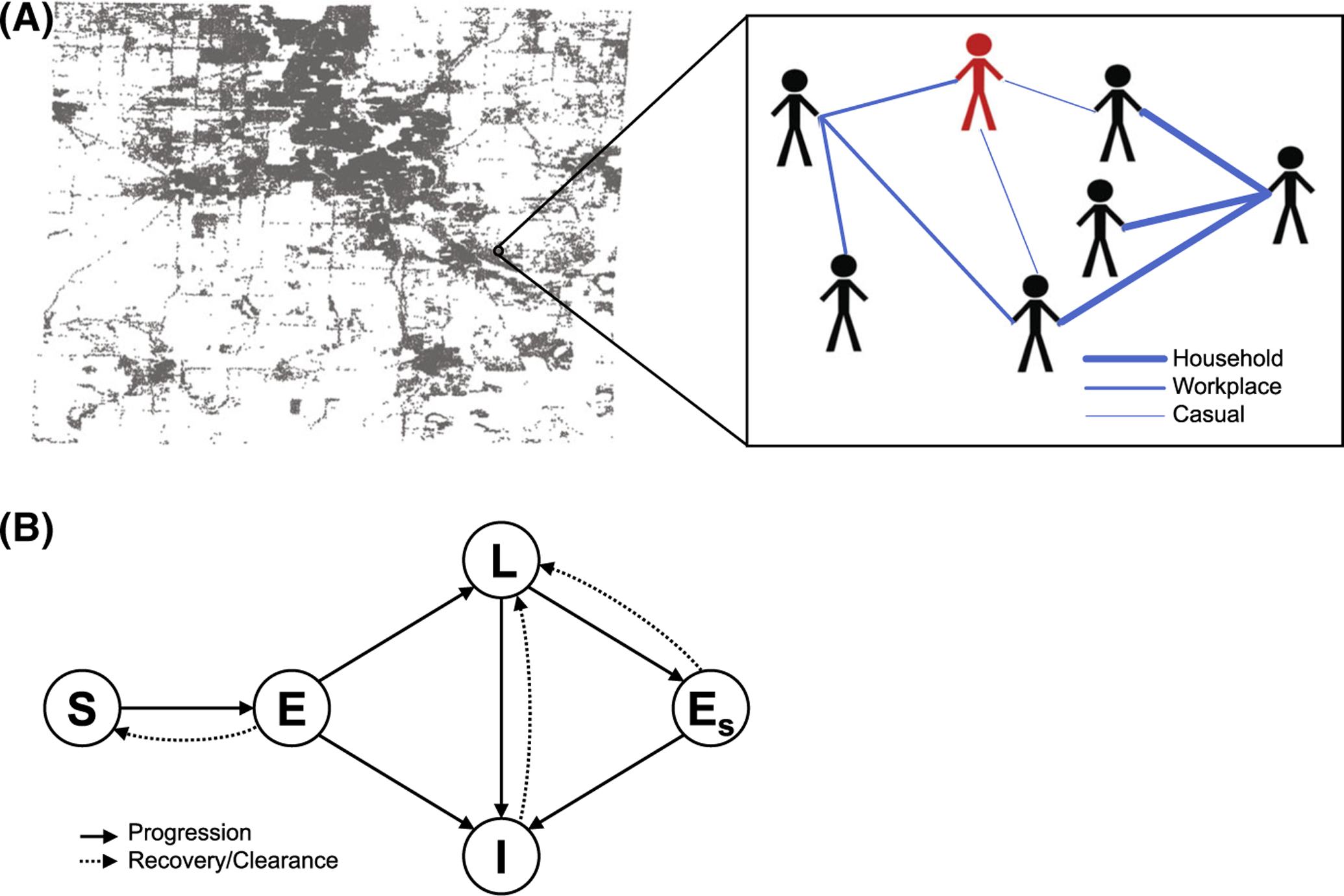
Fig. 1.

a Illustration of the population and network structure described in Sect. 3.1.1. Distribution of households in Washtenaw County and a hypothetical example of a small contact network with different types of contacts are shown. Thicker edges correspond to heavier contact weights. One individual is shown in red to indicate active infection. b Diagram showing all possible model pathways described in Sect. 3.1.2. S denotes susceptible, E denotes exposed, L denotes latent, I denotes infected, and Es denotes secondary exposure
