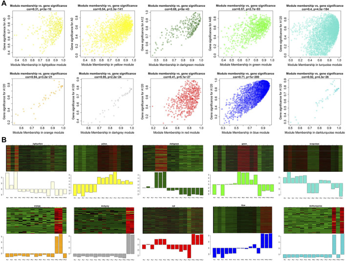
FIGURE 8.
Visualization of GS vs MM and expression level in 10 interesting modules. (A) A scatterplot of GS for differentiation stage vs MM in modules; (B) The heatmap and bar plot represent the expression level of genes in modules in 15 samples. The color ranging from green to red in heatmap indicates higher expression levels.

