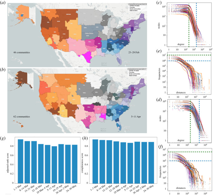
Figure 2.
Communities of people that mostly move within the same area on (a) 23–29 February and (b) 5–11 April. Communities are shown by different colours. Colour hues represent clusters of communities that have higher mobility connections among themselves. (c) and (d) show distribution of number of in and out links to each node (degree) inside the communities of (a) and (b). (e) and (f) are the distance distribution of links inside the communities of (a) and (b). Axes are logarithmic in the distribution panels indicating that after a threshold, degrees of nodes and distances between nodes decrease by a power-law behaviour towards larger degrees and distances. (g) and (h) compare the deviation of the communities in week 23–29 February from other weeks through adjusted rank and completeness scores.

