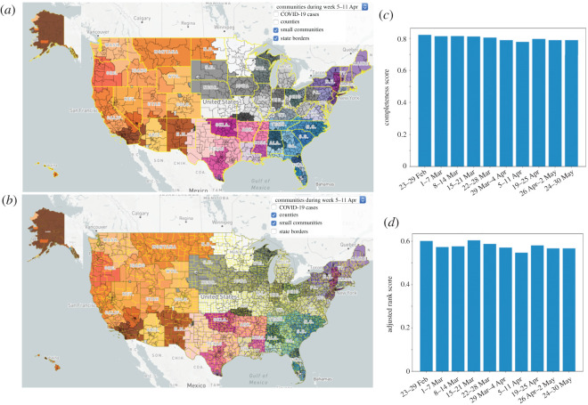
Figure 3.
Communities (separated by different colours) and their sub-communities (separated by black lines) of the mobility pattern of the US on 5–11 April. Yellow lines show (a) state boundaries and (b) county boundaries. Deviation of communities and sub-communities from the administrative borders are clear.

