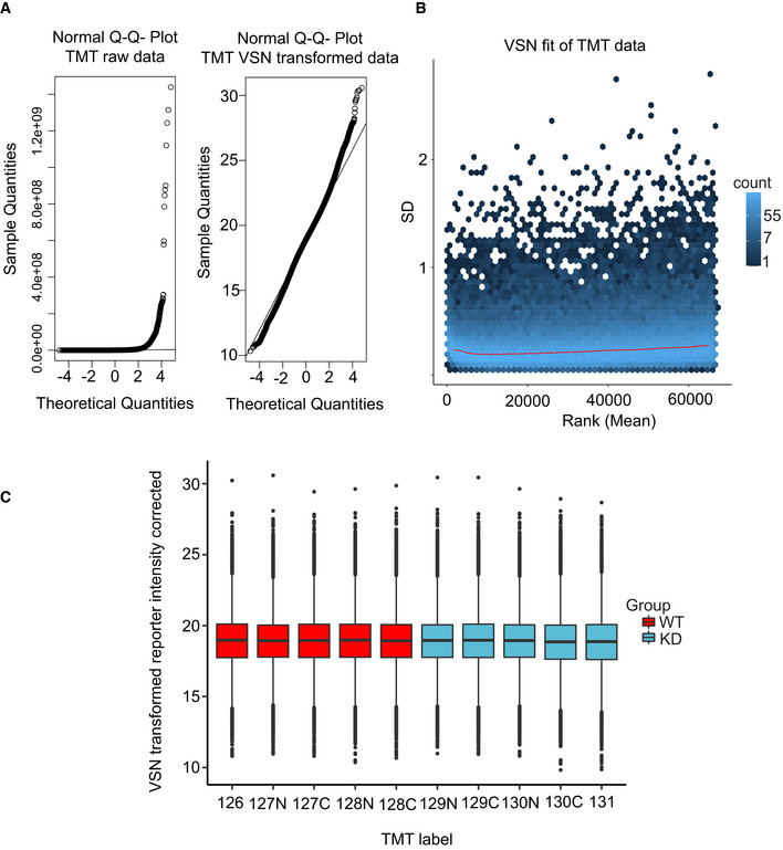
Figure EV3. Phosphoproteomic data quality control.

- Left: Normal Q–Q plot of the raw TMT intensity data with large deviations from a normal distribution as seen from datapoints not following the indicated line in the plot. Right: Q–Q plot of the TMT intensity data after VSN transformation. Only minor deviations from the line indicates the transformed data follow a normal distribution to a satisfactory degree. The hypervariable datapoints in the upper quantiles are controlled by the application of the robust implementation of the empirical Bayes algorithm used by limma (Phipson et al, 2016) and implemented in the analysis scripts.
- Standard deviation plotted against the intensity rank of the VSN‐transformed TMT data. Red line indicates the mean standard deviation. Line is approximately horizontal, indicating that the variance is not overly dependent on intensity rank and suggests a successful VSN transform.
- Boxplot of intensity distribution in each TMT channel. No obvious discrepancy between the median values of the individual channels indicates a successful calibration by VSN and no introduction of an obvious intensity bias for any experimental group. The central band of the boxplot indicates the median value, while the hinges represent the first and third quartile (bottom and top of boxplot, respectively). The whiskers extend to the largest/smallest (upper or lower whisker, respectively) datapoint not further than 1.5 times the interquartile range from their respective hinge. The experiment was conducted using five biological replicates of CDKL5NLS WT (WT, red) and CDKL5NLS KD (KD, blue) where each TMT channel represents a single biological replicate from the respective group.
Source data are available online for this figure.
