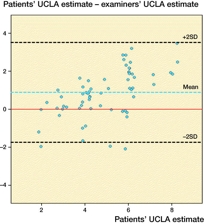
Figure 3.
Patients’ UCLA estimate plotted against the difference between patients’ and examiners’ assessments (patient score minus mean of surgeons’ and physiotherapists’ scores) (modified Bland–Altman plot). The dotted lines indicate mean difference (blue) ±2 SD (limits of agreement, black) and hypothetical perfect agreement (red). Random variance (jitter) is added to prevent over-plotting.

