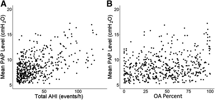
Figure 2. Scatterplot diagram of mean PAP compared to AHI and OA percentage.
Comparison of total AHI (A) and OA percent (B) to mean PAP level. AHI showed the strongest correlation (r = .51, P < .001) while OA percent was weakly correlated (r = .22, P < .001). AHI = apnea-hypopnea index, OA = obstructive apnea, PAP = positive airway pressure.

