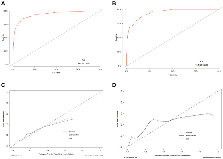
Figure 3.
The evaluation of the nomogram to predict BCBM. The ROC curve in the training cohort (A) and the validation cohort (B). The C-index is represented by the area under the curve. The calibration curve in the training cohort (C) and the validation cohort (D). The C-index is represented by the area under the curve. The closer the curve is to the dashed line with a slope of 45°, the higher the calibration of the nomogram.

