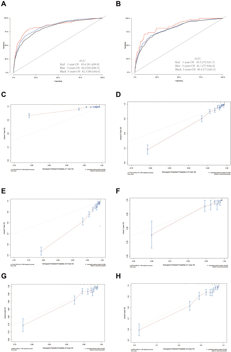
Figure 5.
The evaluation of the nomogram to predict the prognosis of BC. The ROC curve in the training cohort (A) and the validation cohort (B) in 1, 3, and 5 years. The C-index is represented by the area under the curve. The calibration curves in the training cohort (C–E) and the validation cohort (F–H) in 1, 3, and 5 years. The C-index was represented by the area under the curve. The closer the curve is to the dashed line with a slope of 45°, the higher the calibration of the nomogram.

