
Fig. 4. Colocalisation plots. Each plot shows the association signal and the −log10 P-values.
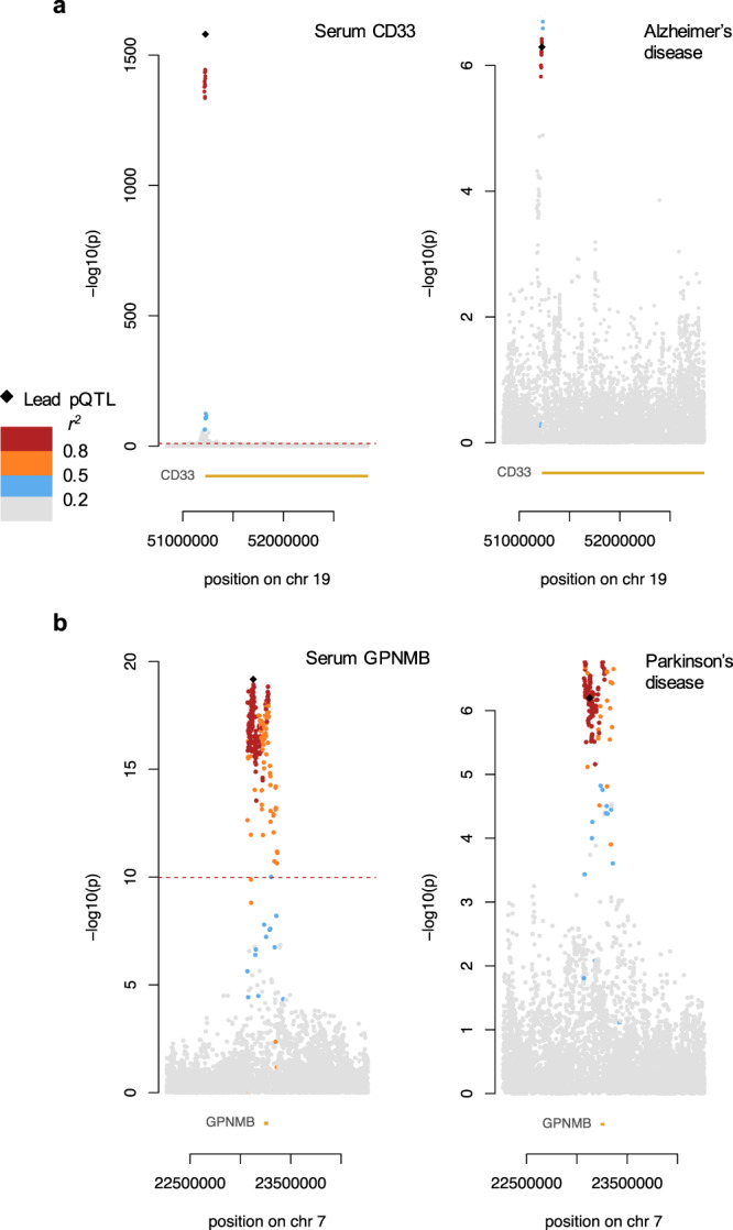
The lead pQTL variant is represented by a black diamond, while other points are variants that are coloured according to the extent of linkage disequilibrium with the lead variant. The location of the genes of interest are also shown in yellow at the bottom of each plot. Significance thresholds used for each respective study are shown using a dotted red line. a Left: Protein QTL signal for serum CD33; right: GWAS signal for Alzheimer’s disease. b Left: Protein QTL signal for serum GPNMB; right: GWAS signal for Parkinson’s disease.