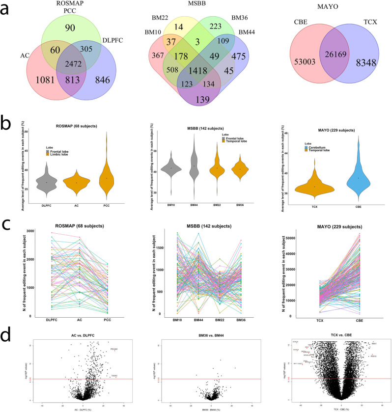
Fig. 3. Distributions of frequent RNA editing events across brain regions.
a Venn diagrams show the number of frequent (≥10%) RNA editing events present in different regions within different studies. b Violin plots show the distribution of the per sample values of the average level of all frequent RNA editing events. c The total number of frequent RNA editing events called within each subject across different regions. Each line represents one subject while the connection dots represent the number of frequent RNA editing events called in that subject for the corresponding region. d Volcano plots show the differences between 2 tested brain regions in the level (% alternative reads) of each RNA editing event (shown as one dot). X and Y axes display the regression coefficient and its corresponding −log10 transformed P value from the mixed linear regression model with the subject as random effect and fixed covariates of age at death, sex, postmortem interval, and RIN score. The displayed P values were not adjusted by the multiple testings and were derived by two-sided tests. The red horizontal line showed the Bonferroni-corrected P value threshold of 1.49 × 10⁻⁶ (0.05/33,641). The red dots with annotated gene names are those RNA editing events with P ≤ 1.49 × 10⁻⁶ and regression coefficient of the differences between 2 brain regions ≥30%.

