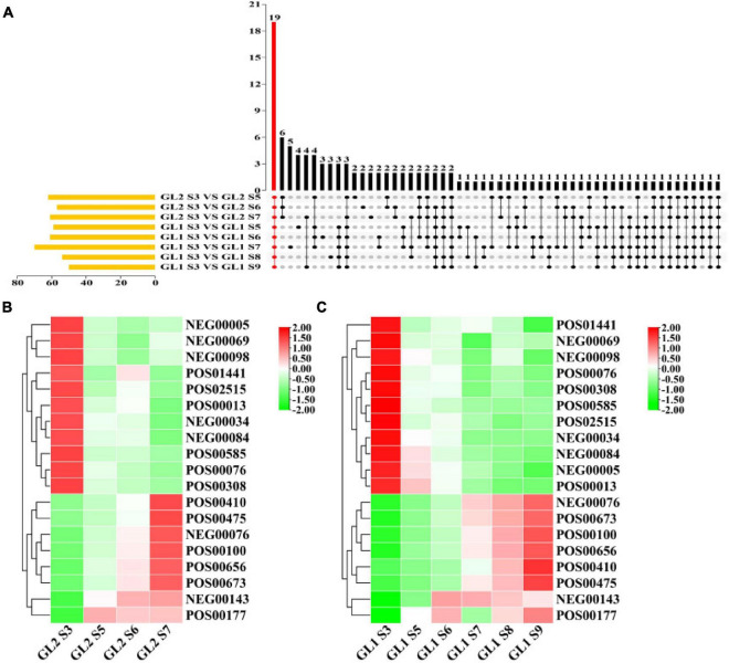
FIGURE 3.
Upset analysis of maturation-related metabolites (A) and heat map of expression levels of metabolites on ‘Ganlv 2’ (B) and ‘Ganlv 1’ (C). In (A) the yellow bar on the left represents the number of metabolites in the comparison group. The black dots on the right represent that these metabolites appear in the corresponding group, and the gray dots represent not. Metabolites present in all comparison groups were marked in red. In (B,C) the bar on the right represents the normalized coefficient range of the expression level. The redder the bar is, the higher the expression level, and the greener means the lower the expression level.

