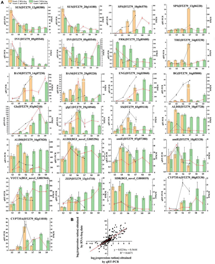
FIGURE 8.
Analysis of gene expression of key candidate genes. Expression level by qRT-PCR and RNA-Seq (A), the bar chart is RNA-seq data, yellow and green represent ‘Ganlv 2’ and ‘Ganlv 1’, respectively; the line chart was qRT-PCR data, black and red represent ‘Ganlv 2’ and ‘Ganlv 1’, respectively. Correlation analysis of RT-qPCR data and RNA-seq data (B).

