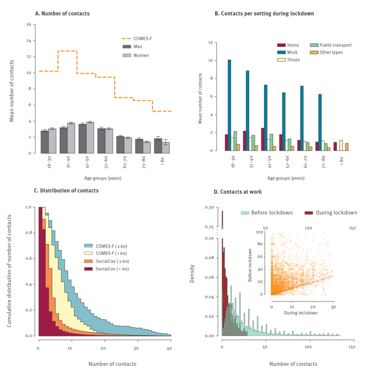
Figure 1.
Number of contacts by age group and setting, during and before lockdown, France, April 2020
A. Mean number of contacts depending on the age of participant. For each age group (x-axis), the bars represent the mean and 95% confidence interval (CI) of the number of contacts reported by participants, whatever the setting. The orange line represents the mean number of contacts for the COMES-F study [10]. To compare the two datasets, individuals with more than 40 contacts per day were not considered.
B. Mean number of contacts depending on the setting. For each age group (x-axis), bars represent the mean number of contacts for each setting reported by participants.
C. Light blue and yellow curves show the cumulative distributions of the number of contacts for participants in the COMES-F dataset aged 18–60 years and older than 60 years, respectively. Orange and red curves represent the cumulative distributions of the number of contacts for participants in the SocialCov study for participants aged 18–60 years and older than 60 years, respectively. To compare the two datasets, individuals with more than 40 contacts per day were not considered.
D. Distribution of the number of contacts at work before lockdown (grey), and during lockdown (red) only using observations up to the 95 percentile. The inset shows the change in the number of contacts before and during lockdown at the workplace for participants working outside their home during the lockdown (orange).

