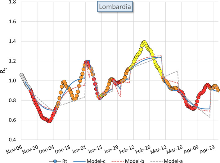
Fig. 7.
Estimated values in Lombardia computed with the Model-a (grey dotted curve), Model-b (pink dotted curve) and Model-c (blue curve) compared with the measured values of (colored dots). The colors of the dots correspond to the three NPI levels yellow, orange, red. They are delayed by 8 days as computed in the text. For this reason, the first 8 values of are colored in grey since they don’t correspond to any of the three NPI levels here considered. We remind the fitted value is set equal to (t) at any change of NPI level

