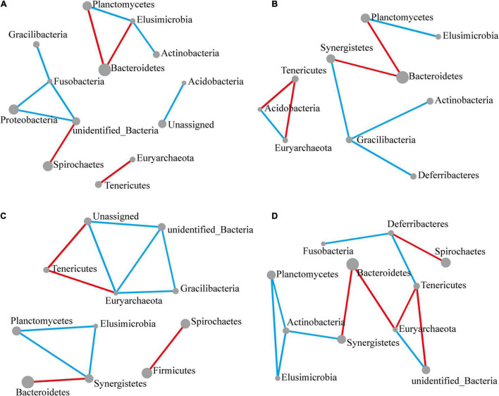
FIGURE 4.
Significant changes in interactions at the phylum level. The size of each node reflects the abundance of each phylum, while the width of each line connecting two nodes corresponds to the strength of the interaction between the phyla representing each node. A blue line indicates that interactions were positive, while a red line indicates that interactions were negative. In all cases, the control group was used as a comparison and Pearson’s product-moment correlation was used to determine interaction strength (P-value ≤ 0.05). (A–D) Network diagram showing interactions at the phylum level, respectively, at 12 (A), 24 (B), 48 (C), and 72 h (D) following M. robertsii infection.

