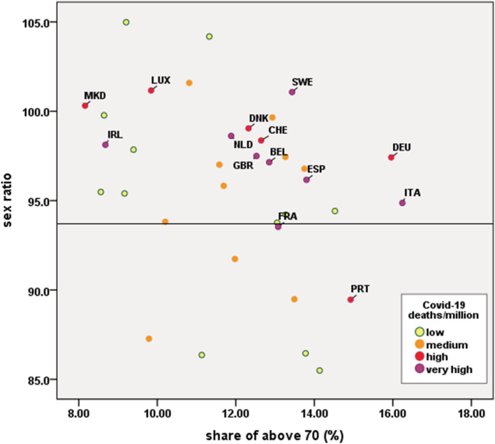
Figure 2.

Correlation between demographic parameters (sex ratio and share of above 70 years of age) and Covid‐19 mortality rates (per 1M of population). Note: Vertical axis refers to the number of men for every 100 women; horizontal axis refers to the share of above 70 in total population. Each dot refers to a country; the colour of each dot illustrates how high the number of Covid‐19 deaths/million persons is. In bold the 15 hardest hit European countries (as mentioned in our analysis)
