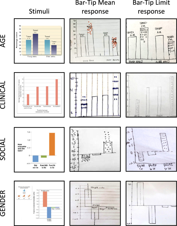
Figure 13.

DDoG measure readouts illustrating the two common, categorically different response types for each of the four stimulus graphs. The left column shows the four stimulus graphs (AGE, CLINICAL, GENDER, SOCIAL). For each stimulus graph, the center column shows a representative correct response (Bar-Tip Mean), and the right column shows an illustrative incorrect response (Bar-Tip Limit).
